Add MobilityArena as a preferred source on Google
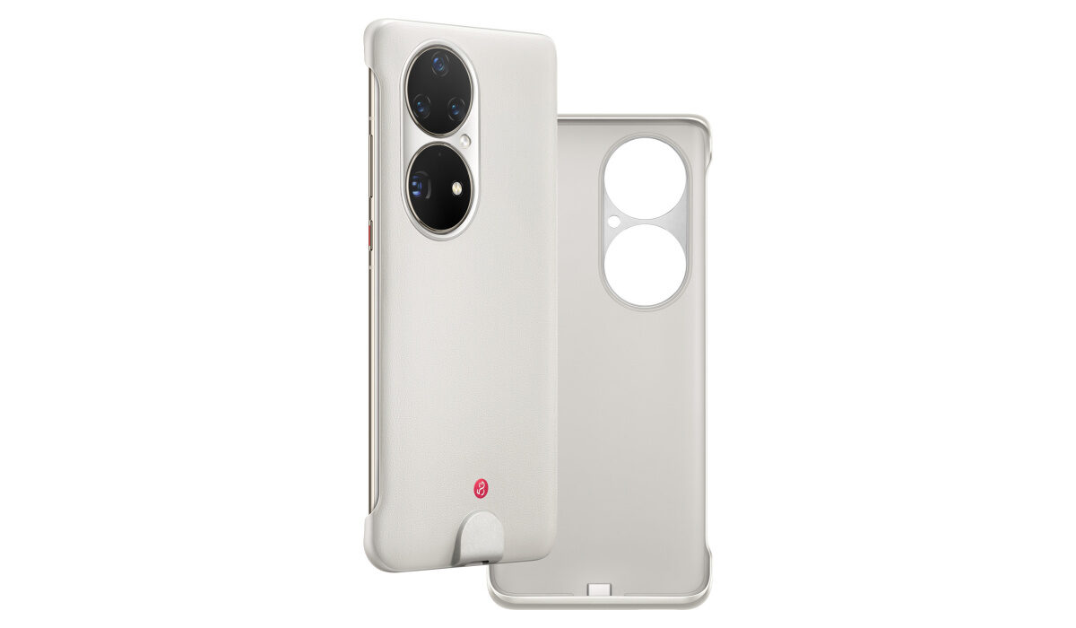
The idea of adding 5G connectivity to a 4G cell phone is a brilliant solution, and it is a surprise that someone did not think of it before now. The good thing is that it is here now, thanks to Huawei and a company called Soyealink. Soyealink made a 5G case for Huawei P50 Pro, so owners of the phone can use 5G on it. Here’s the back story.
If you have been following smartphone news, you already know that a few years ago, the US government placed a ban on Huawei . That ban includes cutting the company off from access to 5G components and technology. As such, Huawei has not been able to manufacture any 5G phones. Yes; all of Huawei’s premium flagships since the ban have been 4G cell phones. That’s a big problem, and it has been solved with Soyealink’s 5G case for the Huawei P50 Pro.
Now, you can add 5G to a 4G phone by using a case
The case has a built-in 5G modem and e-SIM, so it can connect to 5G networks. It also has a USB connector that is used to connect it to the P50 Pro to pass on service to the phone. Snap on the 5G case to the phone and you have a 5G-connected 4G smartphone . Did I say earlier that it is brilliant? Absolutely.
This might be the beginning of a new line of products – plug-in accessories that add 5G connectivity to non-5G cellphones. So, besides cases, we might see 5G USB adapters that you can plug into a 4G or 3G phone, so it can access 5G service. Why do you have to change a smartphone you like just so you can enjoy 5G? I really like this idea. We will definitely see more 5G cases hit the market, and they won’t be only for Huawei smartphones.
- Don’t miss our reviews .
- Follow our news on Google News .
- Join our WhatsApp Group , to be notified of the most important articles and deals,
- Follow us on Instagram , Facebook , Twitter , and YouTube .
Author:Mister Mobility
Digital Skills and Communication Coach | Mobile Phone Connoisseur since 2001 | Tech Blogging since 2004
Add MobilityArena as a preferred source on Google
When it comes to browsing the internet these days, the vast majority of us are mobile first. We do our weekly shops via our iPhones, scour for holidays on our tablets and enjoy reading up on the latest news through our Androids.
So, for web designers mobile is now a first thought, and if your website isn’t cut out for it, then you’re going to see your results dropping significantly.
It’s easier than ever to design mobile websites these days, and many website builders online will now offer this service, as well as provide other agencies the opportunity to offer it through white labelling. Brands such as Duda have become synonymous with it, offering white labelled mobile websites to agencies, which tend to fall around a handful of key principles.
Duda for SaaS platforms allows others to use those principles and if you’re looking to build or develop your own mobile website, then here are the top tips you must take on board…

Be Responsive
Mobile devices come in all shapes and sizes and therefore you need to factor that in with your website design and build. Then you’ll of course have your desktop version, and again screen sizes on laptops and monitors vary.
Therefore, building a responsive website is the best way to go about your site’s design and build. This will mean your website can adapt to the various shapes and sizes while also accommodating for all the content it’s displaying. This leads to a much cleaner and navigable website and is a must for anyone in that design and development phase.
Make Content Easy To Read
Smaller screens make life more difficult to read, and when you combine that with the fact that the vast majority of people scan read on their mobile, you need your content to stand out and be easy to read and understand.
You can have the best content in the world, but if it can’t be read then it’s utterly pointless. Think about the colours and fonts you are using and ensure that they work alongside one another. Using sans-serif fonts have proven to be a go-to for many brands as they are proven to be easy to read and keep people on the page longer.
Priorities UX Over Fancy Designs
Users on mobile purely care about the content. They don’t need fancy designs that swoop and swirl. It’s all about getting the information in the best possible way . That means you should 100% prioritise what the user wants from a page and the best way to get it.
That means clear font, and simple “gestures” which will ultimately allow people to navigate through the page much more easily. Are scroll bars really necessary, for example, when we use our finger to swipe and slide?
It’s all about that ease of transition, moving down the page and from one to another. Think about the motions we use with our mobile devices and factor those in. It adds comfort to the user and ultimately builds trust as the end user has been thought about at every turn.
- Don’t miss our reviews .
- Follow us on Instagram , Facebook , Twitter , and YouTube .
