Add MobilityArena as a preferred source on Google
The Apple iPhone 11 was released in September 2019, making it about a year and half old in the market right now, but it is easily my best iPhone model right now, and the one I’d buy today.
That might sound odd to smartphone enthusiasts, who’d normally go for the latest shiny model. That would be the iPhone 12 Pro Max, and it is also the most powerful iPhone around today? So, why is the iPhone 11 my favourite model?
I lay out my reasons below.
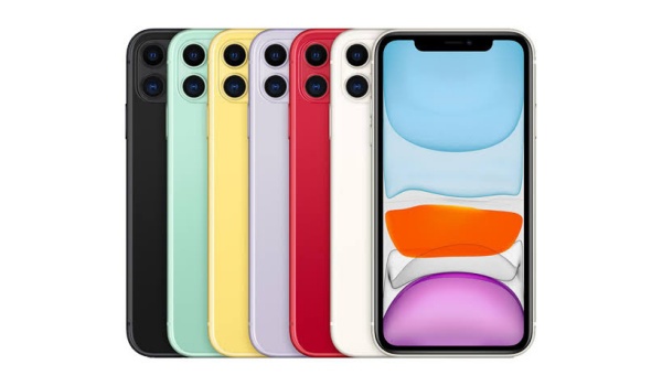
Apple iPhone 11 is my best or favourite iPhone model
Battery Life
iPhones have a nasty reputation with battery life. If you have never used an Android premium flagship smartphone and experienced the bliss of not having to look for a charger every few hours, you’d never understand.
But as someone who has experienced that for years, should I ever have to switch to iOS, battery life would be high on my list of priorities. And the iPhone 11 has good battery life, one that is significantly better than that of its successor, the iPhone 12.
To be sure, it doesn’t have the best. The 11 Pro Max and 12 Pro Max have marginally better battery life, but they lose a few points on another factor that is important to me.
Compact Size
I want my smartphones compact in size. In 2021, that’s anything that maxes out at 6.2 inches in general.
With 6.5-inch displays, the size factor eliminates the Pro Max models. I can give up the marginal extra battery life to have a smartphone that feels more comfy in my hand.
And that phone is the iPhone 11 with it’s nice 6.1-inch display and comfy size.
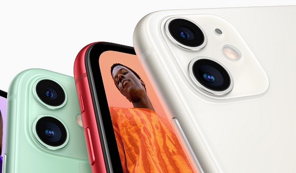
I am not worried about photography and video recording, because again, the differences between what the iPhone 11 and the 11 Pro Max and 12 Pro Max offer are not that big. I can live with that.
Also, I am not worried about performance. The Apple A13 Bionic chipset and 4 GB RAM in the iPhone 11 is a competent combination and delivers effortlessly.
In summary, Apple iPhone 11 is my favourite iPhone model today because it offers good battery life and good performance in a compact body. Thankfully, it also has 18W fast charging, so the battery gets topped up fast.
Thanks to Apple’s reputation with software updates, the iPhone 11 is also up-to-date in terms of software. What is not to like about it?
Which is your favourite iPhone model?
It is great to own the latest and greatest model of your favourite phone brand. But sometimes, the latest model is not what’s best for you.
If battery life and compact size are top priorities for you, you should have a look at the iPhone 11. If they are not, you must figure out which of the available modules fit your specific needs or wants. Your phone; your preferences.
So, share yours. Which is your favourite iPhone model, and what about it makes it your preferred?
Author:Mister Mobility
Digital Skills and Communication Coach | Mobile Phone Connoisseur since 2001 | Tech Blogging since 2004
Add MobilityArena as a preferred source on Google
Most users end up on your website through their phone, so it is imperative they have an easy and accessible experience. No matter the device or operating system, you need to make sure the mobile version of your website is clean and clear for all users.
Here are a few tips and tricks to be aware of that will guarantee a better experience for users.

1. Make Navigation Clear
Think of your website as a map, and navigating it should be as easy as reading instructions on how to get from point A to point B.
Don’t overload the site with directions as there is not as much room as a desktop format to keep a permanent menu available on every page.
Install a hamburger drop-down menu instead to keep your menu smaller and out of the way. But also make sure this drop-down is clearly visible in the top corner.
2. Choose Your Fonts Wisely
Readability is extremely important. A smartphone is only a few square inches, so you want to keep out any visual mess. Stick to one or two simple fonts.
Also, be sure to keep the sizes consistent from page to page. Don’t go too big, or you’ll run out of room on the page, but don’t shrink the fonts just to fit more information. Mobile websites need to be concise, only include your most important eye-catching information.
3. Accessibility
Mobile UX needs to be simple and involve as few clicks as possible. For example, try to avoid complex booking systems that require many pages to sift through. At roverd.com , you can find a streamlined way to book appointments or make reservations. This is great for mobile if you want to keep customers on your page.
You never know who will be checking out your page so make sure it is accessible to folks with disabilities. Have an option for an extra-large font easily available. Even consider offering a speech-to-text function, so people can follow along while reading if need be.
4. Take It Easy
Your online website is not the place to go wild. Animations, gifs, and videos that play automatically should be avoided at all costs. Not only are they distracting, but they will increase buffering times.
A simple clean design is the best is the approach. Less is more when it comes to mobile sites, you don’t want any confusion when the page is opened. There should be a clear landing page that has options to send the reader off to whichever page is right for their needs.
5. Optimize Speed
No one has time to waste on a mobile website. If a page is not loading quickly on your phone, then chances are you’ll just close out of it. Run a free speed test on your website to see how much faster you can make it.
You want everything running quickly from the top down. That means using small image files and compressing any large files. It is ok to turn down quality on images, it won’t be noticeable on such a small screen. Even just resizing images will decrease their size and make your system run smoother.
6. Test to Start Piling Up Clicks
Once you’ve got a great, fast, and beautiful mobile website you will get more and more visitors. Test out your new site on any phones you can get your hands on and see what changes you can make to maximize impact on iPhone or Android.
Start designing now and with these best practices you can enjoy your new state-of-the-art site.
